Inspiration behind the Outerboro logo
When we first designed our logo, we were like many other start ups, sitting through endless designs and concepts, and flipping through books and the internet in search of inspiration. We wanted it to be simple and straightforward, yet conveys immediately what we are about.
After proposing countless design ideas, our design guru who is also our marketing head, James, came up with the brilliant design that everyone took a liking to:
![]()
Our logo is simple enough. Set in a circular, wheel-like frame, it combined our love for the great outdoors, while living in urban cities, into one simple design. The wheel-like frame is actually also shaped like a gear that keeps everything in motion, signifying our lifestyle that is perpetually on the go and a need to always be ready.
![]()
Leave a comment
Comments will be approved before showing up.
Also in Blog


Work From Home - Trends And The Most Comfortable Suit

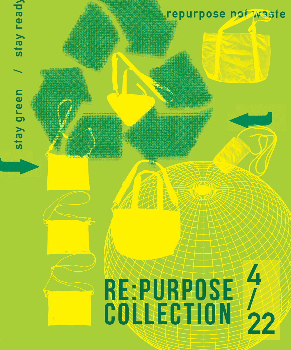
Earth Day - Re:Purpose Collection

Bespoke vs. Made to Measure
Recently we have gotten questions regarding our “Free Alterations Service” and what it entails.
There are three main types of alterations service, and we want to clarify the differences so that you understand what we offer, especially when you purchase one of our suits or pants.